


Heading 6
June 26, 2026
By:
Tayla Mocke
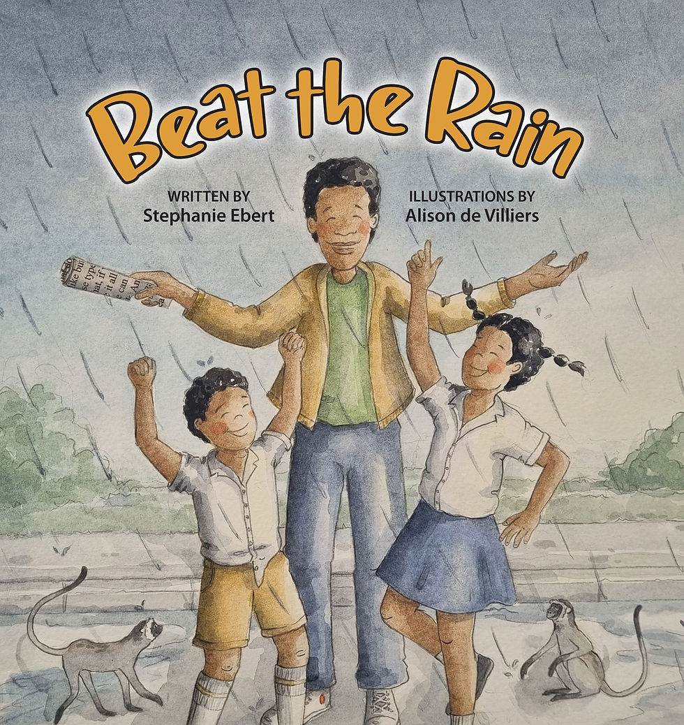
Q&A with Stephanie Ebert and Alison de Villiers, Creators of Beat the Rain
.jpg)
Q&A with Stephanie Ebert and Alison de Villiers
Book Description: Dark clouds roll in. Thunder rumbles through the streets.
Two children team up with town locals in a rhythmic race against the rain, rushing to make it home before the downpour begins.
But the storm catches up—snapping the stoplight and leaving everyone stranded.
In a surprising twist, an unexpected hero swoops in, guiding traffic safely through the chaos with the grace of a conductor leading a community concerto!
A read-aloud book that captures the vibrant culture and charm of daily life through rhythm, repetition, and onomatopoeia.
Buy the book here. Author Bio:

Stephanie Ebert lives in South Africa with her three children. She spent her South African childhood writing stories and climbing avocado trees, before going to university in the USA to study English Literature. When she is not writing her own stories, she enjoys working with her local community to see more South African stories come to life. She is the editor of Little Women by Louisa May Alcott, annotated for teen and middle grade readers (Owl’s Nest, 2024) and co-author of How to Stop a Train: The Story of How Mohandas Gandhi became the Mahatma with Kathryn Pillay (Pan Macmillan, 2024). More information about her writing for adults and children is found at Stephebert.com Questions:
Beat the Rain is driven by rhythm, repetition, and sound rather than rhyme. What drew you to this musical, almost percussive approach to storytelling?
In South Africa, we are surrounded by amazing choral music. My church growing up was in isiZulu, and the acapella gospel choruses have a simple lyrical structure, often with a seemingly simple melody. But through repetition and layering of parts, call and response, and rhythm complexity and richness is built up. Picture books remind me of poetry, in that they are meant to be heard, rather than scanned with our eyes. So much “content” today is “scannable” text - we are just whisking past it, perhaps even scrolling past it on our devices. Picture books are a wonderful antidote to this. You can’t multi-task when looking at a picture book. It’s a full-sensory experience. Your eyes (and your children’s eyes) are feasting on the pictures, and so you want sounds that are a feast to go with it!
The phrase “We’ve got to beat the rain!” repeats throughout the book. How did you think about building tension and momentum through repetition?
The refrain “we’ve got to beat the rain” came up quite naturally with my children! At the time my boys were 3 and 5, and we were racing through our errands in our small town of Hilton, South Africa, to get home in time to bring in our laundry that was drying on the washing line at home before the afternoon thunderstorm. So with every errand, I was hurrying them in and out of their car seats, and we all started chanting, “We’ve got to beat the rain! We’ve got to beat the rain!” It was so catchy, it became the kernel of the story! I love reading aloud to my children, and I realised that whenever there was a refrain in a book, the predictability delighted my children, because they could quickly join in and guess the next phrase. The key was to figure out how to keep it repeating enough that it was fun for the children, but not so often that it was tedious for adults to read!
The story captures a wide range of everyday characters—children, grannies, builders, shopkeepers—all moving through the same moment. What interested you about telling a collective, community-centred story?
I think one of the most beautiful things about growing up is realising that you are part of something bigger than yourself - and that things are going on all around you to make your life happen that you don’t always think about. I remember my boys asking endless questions about how things work - how do traffic lights work? Where does the electricity come from? Who fixes it when it breaks? Our town of Hilton is a small suburb of a bigger city called Pietermaritzburg, but it functions like a small town. It is the kind of place where you wave and chat to the lady selling samoosas outside the grocery store, even if you’re not on a first-name basis, you know each other. At that time our librarian was on a first-name basis with my boys - it’s special to live in a place where you are known.
“The newspaper man” was a real person, too – unfortunately, the man who sold newspapers at our traffic light stopped before my boys were old enough to know him. But he was a fixture from my childhood– we’d always buy the weekend Natal Witness at the intersection on a Saturday morning on the way to my brother’s cricket matches.
And then, I need to be one hundred percent honest and confess, the only reason there are “builders” in the story is that at the time, my kids liked any book with trucks in it. So clearly I needed to think of a way to include some construction vehicles, otherwise what was the point of the story??
The setting feels distinctly South African, yet widely relatable. How did you approach capturing a specific place while keeping the story accessible to a broader audience?
First, I think huge credit needs to go to Alison for her illustrations. It was so fun to collaborate with her on these. We come from the same small town, so she could clearly picture the various locations I was imagining. For example, Mr. Chohan’s shop is a real shop in downtown Hilton! It was called Khubelas. It had that real General Store feel, and unfortunately had to close last year after running for over 40 years. (Here is a newspaper article about the Mohammad’s who bought it from the Chohan’s and unfortunately had to close, due to more retail in Hilton. Here is an article that told a bit of the history of the Chohan’s owning it). We talked to Mr Chohan and got permission to use his name in our story! I think it’s true that “the universal is in the particular” - and the more specific you can be about something, the easier it actually is to relate to!
Our families (both Alison’s and mine) love the Shirley Hughes books - she is a British author and illustrator – and we both loved the particularity of her environments, and her childlike perspective. We could see our children were drawn to those books because they could identify themselves in them. But, we also felt that while it’s interesting to read about British children, we needed more books that were set in South Africa, and reflected the diversity of the children here! Picture books help expand a child’s imagination, but also can reflect their world back to them, and we wanted to add to the books available that would help reflect back something to children in our neighbourhoods about their world.
Since I have family in both South Africa and the USA, it was exciting to think we could share a slice of our lives here with new friends around the world!
The turning point comes when the traffic light fails, and an ordinary figure—the newspaper seller—steps in. What inspired this moment, and the idea of an “unexpected hero”?
This is based on something that happened to me in real life! A few years before my children were born, (when there still was a newspaper man at our traffic light!) the power went out and the traffic light was out. Now, the power going out is actually a common occurrence in our small town - any large thunderstorm knocks the power supply. We also have something in South Africa called “load shedding” where our power is intentionally turned off for periods of time to help spread the energy across the grid in the country. So we are used to the power going out, it’s not an emergency for us. BUT, our little town only has one major intersection, and during morning rush-hour, it gets VERY wild when the power is out. One morning at rush hour the power was out, and I could see how grumpy everyone was sitting at a standstill - when suddenly the traffic started moving again! I wondered if they had sent a traffic cop up to help direct traffic, when I saw that it was actually the newspaper man! He was in the middle directing the traffic and clearly living his best life! He was just like dancing around the middle of the intersection directing all the cars, and he had so much joy! I was inspired to go home and write a poem about it called “Maestro” , because I loved that play on words for conducting - conducting traffic, or conducting music.
There’s a strong musical metaphor at the heart of the story, with traffic becoming a kind of orchestra. When did that idea first emerge in your writing process?

The idea of an orchestra, or playing with the idea of “conducting” first came out of the original poem I wrote. I’ve always loved the poetry of e.e. cummings, and he has quite a few poems where he contrasts these individual, joyful, unique people with the crowd or the “mostpeople” who just kind of robotically go
about their business. I think that was probably in the back of my mind - everyone in their cars kind of grumpy about the light being out, but the newspaper man being truly alive to the moment and jumping in with joy. As I thought about re-writing the idea into a children’s book, I realised that children often have the perspective of someone like the newspaper man – they don’t see the inconvenience of losing power and having a long wait at a traffic light. They aren’t in a hurry like grownups. To them, this is all just an interesting adventure. Other people may not notice the man who sells newspapers at the traffic light every day – but they do!
The book invites participation—clapping, tapping, echoing sounds. How important was it to you to create a read-aloud experience that feels interactive?
I grew up in a family that read books aloud - picture books, chapter books, everything! So books were always experienced through my ears first. When I went on to have young children of my own, I had a pretty strong sense of what I like to read to them and what I don’t like to read. One thing that could always get a giggle from my kids was fun sounds - I realised that since we already had a musical theme with the newspaper man conducting the traffic, it would be fun to emphasize that theme through other sounds, and to try and help the story have a fun rhythm. In South Africa, rhythm is an important part of music, and so I hope that comes through.
The story ends with a shift in perspective: “We didn’t beat the rain, but we don’t mind.” What does this change in attitude represent?
I think this circles back to seeing the world like a kid, rather than seeing the world like a grownup. The grownups are thinking about their laundry getting wet on the washing line, about the long line through the intersection, about how annoying it is to wait in the wet rain at the bus stop. The children are thinking about the monkeys and the puddles and the sound the rain makes on the roof, and the interesting things that people are doing outside of the car window. As a grownup, I can get pretty task oriented and just think about rushing through to what I need to do - but my kids are actually pretty good at helping me see that sometimes, we don’t accomplish our goal, but we had a whole lot of fun along the way. So that’s okay! The British writer G.K Chesterton has some great quotes about this. He was writing over 100 years ago. He talks about how as grownups, most of the things that irritate us have to do with our frame of mind. Running after a hat blown off of our heads? Annoying. But, British gentlemen go foxhunting all the time- that’s fun! Why can’t you imagine your hat is a wild animal and have a great time? As he says, “An adventure is only an inconvenience rightly considered. An inconvenience is only an adventure wrongly considered.”
You’ve described this as a “slice of life” story. What do you think everyday moments—like a sudden storm or a busy intersection—can reveal about community and connection?
Just like in an orchestra where every instrument - and the timing of each instrument’s part- is important, everyone in our communities is important, too! Their jobs may be different, but they are all needed! I wanted to help children enter into that idea through something that they could relate to. We talk a lot in South Africa about our diverse “rainbow nation”, with many cultures and languages. But even though we are all so different, we also have lots in common – and we need each other! We can’t go it alone. I care about these ideas, but I could see my kids’ eyes glaze over whenever I start “preaching” to them, and so was excited about the idea of showing what unity and diversity looks (or sounds!) like, through characters in a small town.
Also, I think Ally and I just wanted to capture something of the specifics of our corner of the world. After reading so many books imported from England and the USA, we wanted to showcase what ordinary life looks like for South African children in the suburbs and small towns here. We have picture books about children out in the rural areas of South Africa, or in the big cities like Johannesburg. But many children in South Africa live in suburbs and small towns, and we wanted them to have the joy of recognising themselves in a story! Of being able to say, “Oh! That’s just like me!” That’s such a special, empowering feeling for a child.
What do you hope young readers notice or feel as they move through the rhythm and movement of the book?
Honestly, I just hope they have fun with it. I hope they are like the kids at the end of the book and say, “More! More! Encore!” and get their grownups to read it to them again. That would be a huge sign that we’ve done our job right! Reading for pleasure, loving the way words sound, seeing beautiful art, experiencing a world in a book… That's our dream and hope for this story!
Illustrator Bio:

Alison de Villiers lives in Hilton, South Africa with her husband and two children. While she didn’t study art or illustration, she grew up in a home where art was a big part of her childhood. After studying a Bachelor in Science, she ended up making her way back to her passion for creating. As a stay-at-home mom and freelancer, Alison finds herself involved in a variety of creative projects from painting murals, to watercolor commissions, woodwork, sewing, interior decorating and gardening.
Questions:
Beat the Rain is full of movement—rushing people, gathering clouds, flowing traffic. How did you approach capturing a sense of motion and energy across the illustrations?
When Stephanie discussed her vision for this story, she presented it as a sparsely worded story with a focus on detailed illustrations. My attempt was therefore to include enough information into each page, so that while a child is listening to the story, they can explore all the small “micro-scenes” happening within each image. This helps create a sense of constant movement and discovery, where something new can be noticed each time.
I also attempted to capture body language in the characters. I think when viewers can relate to a character’s posture or movement, it becomes easier to connect with their emotions—even for background figures or bystanders. The body language of all the characters across the scene plays a big role in building the overall atmosphere, helping to convey the collective sense of motion and anticipation throughout the illustrations.
The story builds from calm to chaos and then back to harmony. How did you use colour, composition, or pacing to reflect this emotional arc?
My use of colour was directed by the natural shift in weather throughout the story. The palette begins with bright, sunny tones to reflect a sense of ease and happiness, then gradually transitions into darker, more muted colours as the storm builds. This shift helps reinforce the growing tension and moodiness in the story.
In terms of composition and pacing, the early illustrations are kept simple and calm, allowing the reader to ease into the story. As the story builds, the illustrations become much busier, with the big storm presented in a detailed double-page spread where all the characters appear and multiple moments unfold at once. This creates a sense of chaos and intensity.
Finally, the last illustration returns to simplicity, showing the calm after the storm. The cheerful newspaper man walking away under clear skies brings back the sense of ease and calm in the story.
There are many different characters in the book, each with their own small story. How did you think about designing and placing these figures to create a lively, interconnected world?
When planning the illustrations, I realised I needed to think about the town as a cohesive, functioning space. The roads, pathways, and directions that characters were moving in all had to make sense in relation to one another. To achieve this, I created a kind of “master map” of the town to ensure consistency across the different scenes. I was fortunate to draw inspiration from the small town of Hilton, where I live.
I also think that the fact that all the characters share similar spaces and are in close proximity, helps build an interconnected world where each small story feels part of a larger whole.
As a fun extra element I included a recurring monkey character on nearly every page, which I hoped would create a thread of continuity throughout the book.
The setting is a bustling small town, rich with detail—from shops to taxis to construction sites. What kinds of visual references or inspirations informed this environment?
As mentioned, the story is inspired by a slice of life in our own town of Hilton in KwaZulu-Natal, South Africa. Much of the environment is drawn directly from what I see around me, which helped ground the setting into something authentic and familiar.
One of the key visual references is the shop where several characters gather to escape the rain—it’s based on a real store in our town. Elements like the mix of construction sites, small businesses, homes, and walkways all reflect the layered, lived-in feel of Hilton.
I wanted the town to feel both specific and relatable, so drawing from a real place allowed me to capture those small, recognizable details that make a setting feel alive and believable.
The moment when the storm hits is dramatic and sensory. How did you approach illustrating rain, thunder, and lightning in a way that feels immersive for young readers?
When working with watercolours, a part of the process involves layering the paint. These darker muted illustrations required more work in order to gradually build the depth required for the atmosphere of the storm. I focused on creating contrast between the dark, moody sky and the sharp brightness of the lightning to provide a visual for the big ‘kerrraaack!!!’ of lightning in the story.

In order to feel the drama of the moment, I combined the elements mentioned above with the expressions and body language of the characters. Their reactions—whether frightened, hurried, or seeking shelter—combined with the threatening sky, aimed to build the sense of tension necessary to bring the experience of the storm to life.
The newspaper seller becomes a kind of conductor, transforming traffic into music. How did you visually translate this idea of “conducting” movement and sound?
I decided to incorporate actual musical bars into the illustration in order to convey the idea that the newspaper seller can hear and appreciate music made by the chaos around him. Elements that move and make noise—like traffic, footsteps, and the bustle of the street—become the “notes” of this audiovisual experience.
The newspaper man is also clearly shown conducting an imaginary choir or orchestra, fully immersed in the moment. His gestures and expression reflect a sense of joy and appreciation, transforming what might feel like chaos and noise to others into something rhythmic and harmonious when viewed from a different perspective.
The illustrations include many small details that reward close looking. How do you balance visual richness with clarity for younger audiences?
As an artist, I do sometimes struggle not to get lost in the details, as I do like to draw accurately (not a requirement for illustration or art but just a personal style). When illustrating machines and cars or figures and their movements; I spend a lot of time studying their dimensions and perspective to ensure they feel believable.
Once I am happy with the form and perspective, I try to simplify certain details so they are cohesive with the other elements of the illustration.
Sound plays a central role in the story—“zoom,” “shoof,” “putta-putta.” How did you think about visually representing or enhancing these sounds on the page?
I paired the onomatopoeic words with the objects responsible for making those sounds, so readers or listeners can easily connect each word to its source.
I also used movement lines to suggest motion, which reinforces the rhythm and energy behind the objects and their sounds. In addition, the orientation of elements on the page—and the different directions in which they move—helps create the sense that sounds are coming from all around.
The book celebrates everyday diversity without explicitly calling attention to it. How did you approach representing a multicultural community in a natural, integrated way?
On a day-to-day basis, this reflects what life in Hilton can look like—a natural and comfortable integration of people from all walks of life sharing the same town.
The story also lends itself to creating a sense of ‘togetherness’ since it involves a universal human instinct: seeking shelter from a storm. In moments like these, people are united by the shared experience, which naturally brings a sense of connection across cultures.
The final scene shifts in tone, with the storm passing and a sense of joy and release. How did you think about closing the visual journey of the book?
The brother and sister duo show the sense of wonder and joy in the chaos that so often only children can appreciate. They find excitement in the rain and storm, turning it into a game or a race. Once everything settles and order is restored, they wish for more excitement and fun.
Meanwhile, the newspaper man moves through the scene with a sense of purpose and quiet satisfaction. His inner sense of rhythm and love for music has allowed him to transform the chaos into something that brings people together. His expression and body language reflect a calm, contented figure walking away peacefully.
The colours in this final scene are bright and cheerful, yet soft and calm, reflecting the overall feeling of calm and harmony as the story comes to a close.
What do you hope children notice—or return to—when they revisit the illustrations?
If children enjoy looking through the illustrations again, I hope they’ll notice the monkeys that appear in most of the pages. This small recurring detail encourages them to revisit the illustrations and discover something new each time.