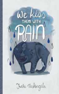

We spend a lot of time talking about what’s inside of our books— and with good reason! But one thing that makes books such a great experience, both inside and out, is the cover art. We’ve been so very lucky to work with artist/writer Karen Vermeulen on a number of book covers, including Love Interrupted, The Thousand Steps, and Unmaking Grace. Karen also did both the cover art and illustrations for Small Mercies, and we’re also proud to be the publisher for her forthcoming illustrated memoir. Stay tuned for more info on that!
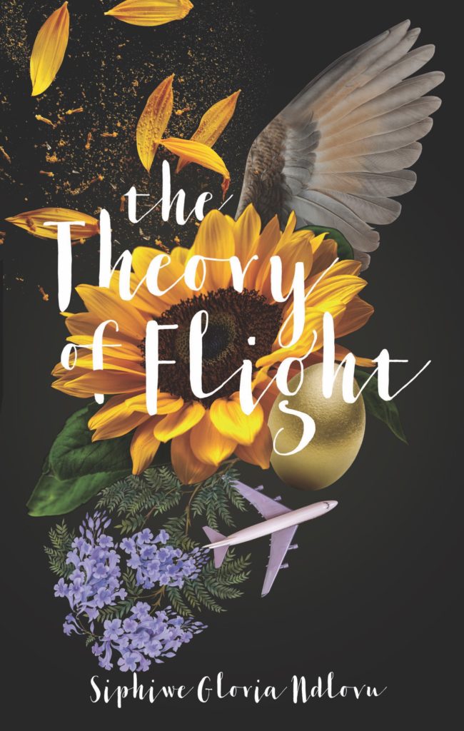
Karen’s work has helped tell a piece of the story before the first page is even turned, and that’s really clear in her cover design for the forthcoming release The Theory of Flight by Siphiwe Gloria Ndlovu. This beautiful novel with hints of magical realism is set in an unnamed African country, and, through the lives of interconnected families, tells the story of decades of national history.
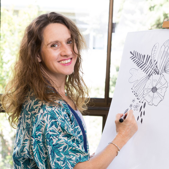
We chatted with Karen about her process of designing the cover for The Theory of Flight. You can read more about her work in this Q&A, and be sure to check out her website, Instagram, and Twitter.
Can you walk us through the design process for designing this cover? What were some of your early ideas?

Whenever I get a cover design project, I start with familiarizing myself with the book. I read the synopsis and skim read parts of the book; unfortunately, I don’t always have the time to read the whole thing!
The Theory of Flight was a relatively easy project as the story is full of beautiful visuals. I did rough mock-ups of three visual concepts using images found online to convey my ideas and sent them to Jessica [Powers, Catalyst founder/publisher]. She then shared it with the author and got input from colleagues and industry insiders. Sometimes the most challenging part of a job is choosing a cover concept, but I think on this one, the dark cover with the photographic collage was a clear favorite.
The initial mock-up and the finished product looked pretty much the same because it was a photo collage made with photos found on a stock image site. Once I got the go-ahead on the concept, I purchased the high-resolution stock images and recreated the artwork.
After that, I will design the spine and the back cover. Usually, there is still a lot of back and forth at this part of the process. I need to add the author’s bio, the synopsis, review quotes, the barcode and tweaking the design to make it all fit beautifully. Once that is done, and everyone is happy with the copy and the design, we’ll get the printer’s specifications. Then I hand my files over to my DTP [desktop publishing] person, Faeez Chetty, who correctly sets it up to be print ready. I used to do this part myself, but I’m not very technically minded, and it took me way too long. I worked with Faeez many years ago in advertising, and I know him to be quick and precise. I’d hate for something to go wrong at the final printing stage!
How do you create a design?
I created this design in Photoshop. Often I sketch first, but with this one, I had a clear idea in my mind’s eye of what I wanted, and it was just a case of finding the right images and playing around in Photoshop until the design clicked into place. Once the collage was working, I scrolled through fonts to find one I think will work with it and added the title and authors name.
How much back and forth do you generally have with the author when designing the cover art? What is the relationship between author/designer generally like?
It depends on the project and the author, some books have a lot of back and forth before everyone is happy, but with The Theory of Flight there wasn’t any! After sharing the ideas with Jessica, who then shared it with Siphiwe Gloria Ndlovu, I got a lovely email from her telling me how much she loves the design! Getting emails like that from authors always make my day.
This is a really beautiful cover even without knowing anything about the book, but once you do read the book, it reveals itself in a completely different way. When you’re designing, how often do you lean toward covers that are more evocative of the general mood/tone of the book vs. those that have really specific thematic/plot elements?
Again it depends on the book. This novel is full of magical realism and striking imagery that I knew would make for a great cover. I love the idea of a design revealing itself to the reader as the story unfolds. It is always a fine line between giving the prospective reader some insight into the book without revealing too much.
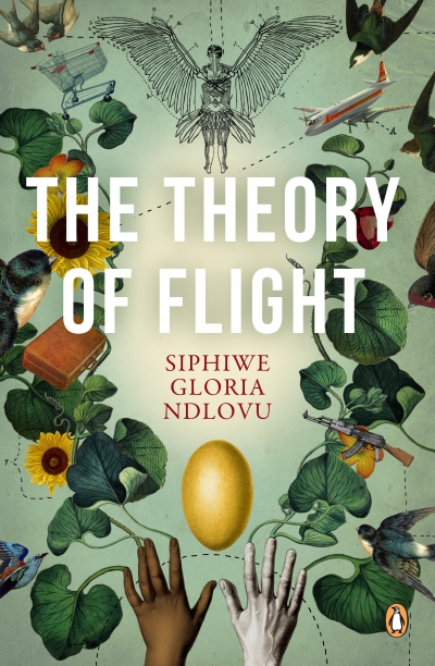
The Theory of Flight, like many of the Catalyst books you’ve designed covers for, was first published elsewhere. Do you ever look at the previous versions of a book when you’re working, or do you avoid them until you’ve finished yours?
I always look! I can’t resist the temptation. And honestly, I’m not sure if it’s better to look before or after the design. I don’t want to create something too close to the previous covers. Also, looking at other designers’ work can give me further insight into the book’s tone and the crucial elements of the story. So, so far, it’s been working for me to peep beforehand.
How do you decide which parts of the story you’d like to highlight in the cover art?
In the case of The Theory of Flight, it was pretty clear which imagery is essential to the story. Other times it’s not that simple, and then I ask Jessica to put me in touch with the author so that I can discuss it before coming up with ideas. Through the years, I’ve learned that doing the work up front can save you a lot of time and back and forth. So, I always try my best to understand the book very well before I sit down and brainstorm ideas. It is probably the most critical part of the process.