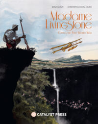


We think our books are good on the inside. Really, really good, in fact. We also think they’re pretty good on the outside, too. We consider it an added bonus. The reason they’re so nice inside and out, is one Karen Vermeulen. Karen is an illustrator who has designed the covers for We Kiss Them With Rain, The Lion’s Binding Oath, and the upcoming Love Interrupted (not to mention the releases coming next year that will have her special touch). We chatted with Karen to talk about her work, what goes into designing the perfect cover, and what’s next for this talented artist.
Keep up with Karen (and Sir Henry) on her website and on Instagram @Karen_vermeulen_illustration
Tell us a little bit about your background.
How would you describe your style?
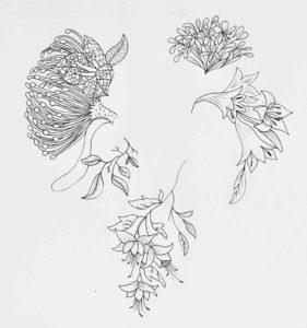
My natural inclination is to draw in a quirky, humorous style, but I adapt it to suit the project I’m working on. Though when I’m doodling in my own time it is definitely funny, googly-eyed animals and odd-looking ladies all the way!
When it’s time for you to work, what inspires you?
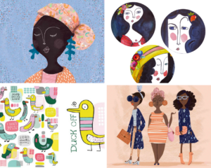
I try to keep my eyes open to ideas and beauty in my day-to-day life and often I will type in ideas on my phone. Also often I will then look at those ideas later and have no idea what they were about! Cape Town is a creative city, we have lots of galleries and beautiful, charming shops and restaurants as well as interesting people. It’s a real melting pot here; we have loads of different cultures and on top of that lots of tourists. In my short drive to work I’ve seen a man in a turban and short-shorts, a guy in an Adidas tracksuit paired with an African head dress, women in head scarves, hipsters with big beards and skinny jeans, German tourists in hiking boots, just all kinds. There is no shortage of beautiful and amusing here. Having said all that, I also still love to travel!
But when it comes to sitting down to work, my go-to is Pinterest. It’s handy that you can search for specific topics and create inspiration boards specific to your project.

When you’re creating a cover, what’s your process?
First, I will read the book synopsis and skim read a few chapters of the book or, depending on how much time I have and how much I’m enjoying the book, I often end up just reading the whole book…I make notes as I read, things like character descriptions, themes, important plot points or imagery that might come in handy. By the time I finish reading I normally have a few ideas floating around in my head. That is when I will turn to the internet, depending on what the book is about I might do further research, looking at pictures of places mentioned in the book, or go onto Pinterest looking for references of the kind of mood I think the book cover should convey.
My conceptual abilities learned in advertising comes in handy here. I try to come up with three ideas that will each in a different way convey the tone and mood of the story and give the potential reader an idea of what the story is about, without, of course, giving too much away. I will then design or draw a very rough cover for each idea that I lay-out in a presentation along with reference images and a short write up to explain the idea. I then send these to Jessica who will often show it to the writer, various colleagues, and people in the publishing industry to gather feedback and input. It can be really hard to decide on which idea is the best one to go with. Once an idea is chosen I will go about creating the finished cover. From here on out the process will differ depending on the cover.
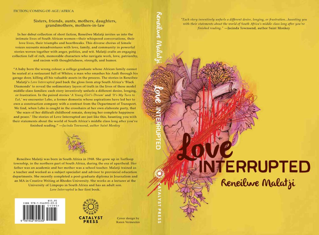
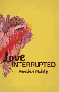
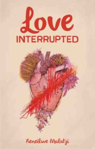
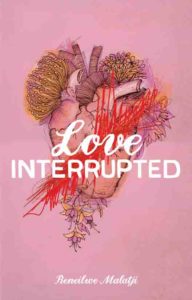
For Love Interrupted the chosen idea was the image of the heart with flowers growing out of it and a bloody gash—the idea behind this image is very much a visual representation of the title. The heart is metaphorically the place where we feel love, the love is visualized by beautiful growing flowers and the red scribbled lines is the interruption of the title. For this cover, I drew the heart and flowers separately in pen, then scanned it in, along with some other hand drawn and painted textures. Then I take it into Photoshop where I layer the scans and digitally paint over it adding colors and building up the drawing. As I work, I play around with different colors, lay-outs, and typography. Sometimes it is very clear to me what is working and what isn’t, and other times I will throw it back to Jessica. In this case, I sent her a bunch of options and after further consulting on her side we had a favorite that I then refined.
Once the cover is decided I have to also design the spine and the back page adding all the little details like the barcode and logo (which I actually designed as well!) The book gets printed first for review purposes, during this time the book is still getting edited, so before it goes to final print I will have to tweak the design with the final spine width make whichever final amendments and changes need to be made before handing over final artwork ready to print. This whole process would be stretched out over months and It’s always fun to see the final product in the end.
A cover goes through so many changes before it’s final. What are some of the reasons you’ve had to go through the design process again?
Sometimes the changes are purely design-driven, and other times the cover would change to better convey what the book is about or to better appeal to the intended target audience. For example, a cover might look too childish when it is actually aimed at an adult market or visa-versa. Or the colors could be too happy when really the book deals with very sad topics, or it could be purely a design issue where one lay-out or color just works better aesthetically than another. The best book cover is one that works from a visual, design point-of-view as well as giving the reader a good idea of what the book is about and what feelings the book might evoke without giving away the whole story.
What role does color play when you’re working on a cover design?
Color plays an important role in conveying the tone, mood, and even theme of the book. You want the colors used on the cover to evoke the same feeling reading the story would. For instance, a thriller could have a dark color that gives you an idea of the ominous nature of the story or as in the case of Love Interrupted, I wanted to cover to convey the fact that these are bittersweet African stories that are both sad and funny. This was a bit trickier and I went through a few color options before settling on one with the help of Jessica. In the end the greeny, mustard yellow we chose, I think, gives you a sense of Africa and works well with the colors of the heart and flowers and the tone of the story. Choosing a palette is very much an intuitive thing for me. It’s not always easy to explain in words why one color works or another doesn’t.
Who are some artists you admire?
There are loads of illustrators and artists who inspire me. In terms of current artists, I love the work of children’s book illustrators David Roberts, and Alex T Smith, both of them do great quirky, expressive characters. Also, the work of Renee French an artist who does amazing acrylic paintings of cute, weird animals. And when it comes bygone artists I love Matisse; his work still looks fresh and modern after all these years and he shares a name with my cat!
What’s next for you?
Actually, I’m working on a book for Catalyst! I’ve illustrated many books in my career and for the first time I’m writing and illustrating my own book! It is going to be a collection of funny, personal essays. It’s all about my life in Cape Town as a single woman in her late thirties, my cat, my friends, my love life (or lack of a love life). It’s fun and exciting and daunting and wonderful and awful to be working on my own book! I’m hoping it will be the first of many and that there is a lot more writing, designing, and illustrating in my future.