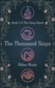
There is a lot that has to happen behind the scenes before we can get our books to readers. Edits, rewrites, marketing, event planning, design—it’s nothing if not exciting! While our author Q&As and From the Editor’s Desk features generally cover many of those (and if you don’t know what those are, all will be revealed if you subscribe to our newsletter!), but we focus on cover design a bit less often. That changes today! We talked extensively with artist Karen Vermeulen last year about her work, and now we’re chatting with Karen again about just one cover— the upcoming YA sci-fi novel The Thousand Steps by Helen Brain.
The Thousand Steps is the first in Helen Brain’s Fiery Spiral Trilogy, and is a dystopic sci-fi Young Adult novel set in Cape Town in 2055. After spending her entire life living in a bunker deep inside of Table Mountain, 16-year-old Ebba is released when the truth of her lineage is revealed. While learning to navigate the unfamiliar “Above,” Ebba must fight for her survival, and that of her friends still below. The Fiery Spiral is an eco-feminist trilogy that examines how class, race, and social identity are foundational to the ways in which society is organized and power wielded. It releases on January 7.
You can learn more about Karen and her work at her website, Instagram, and Twitter.
How did you approach the design?
I love YA, post-apocalyptic, and supernatural novels so I was excited to work on this as it ticks all the boxes. Plus my desk faces Table Mountain, so it was fun to imagine it as a hollowed-out bunker every time I looked up from my work.
Step one is always to read! I take notes as I read of anything that might be crucial to the story as well as visual cues that could work on the cover. I also asked Jessica and Helen about any important themes and story-lines in this book and the series. This cover would eventually have to work in a set, and I didn’t want to design future-me into a corner.
Once I have done my information gathering, the next step is to go visual hunting-gathering. I knew from Helen that the amulets representing the four elements play a crucial role in all the books, so I scrolled through Pinterest to look at different ways of showing that. I also searched for various references based on the notes I took as I read. I put together mood boards and take more notes as I do my research. Armed with all my notes and visual references, I start refining my ideas and make rough mock-ups of what a cover might look like. Then I put together a presentation of three concepts.
Can you take us through the process of some of the early drafts?
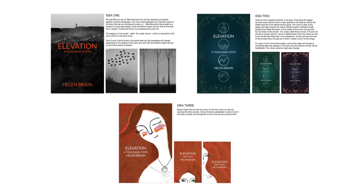
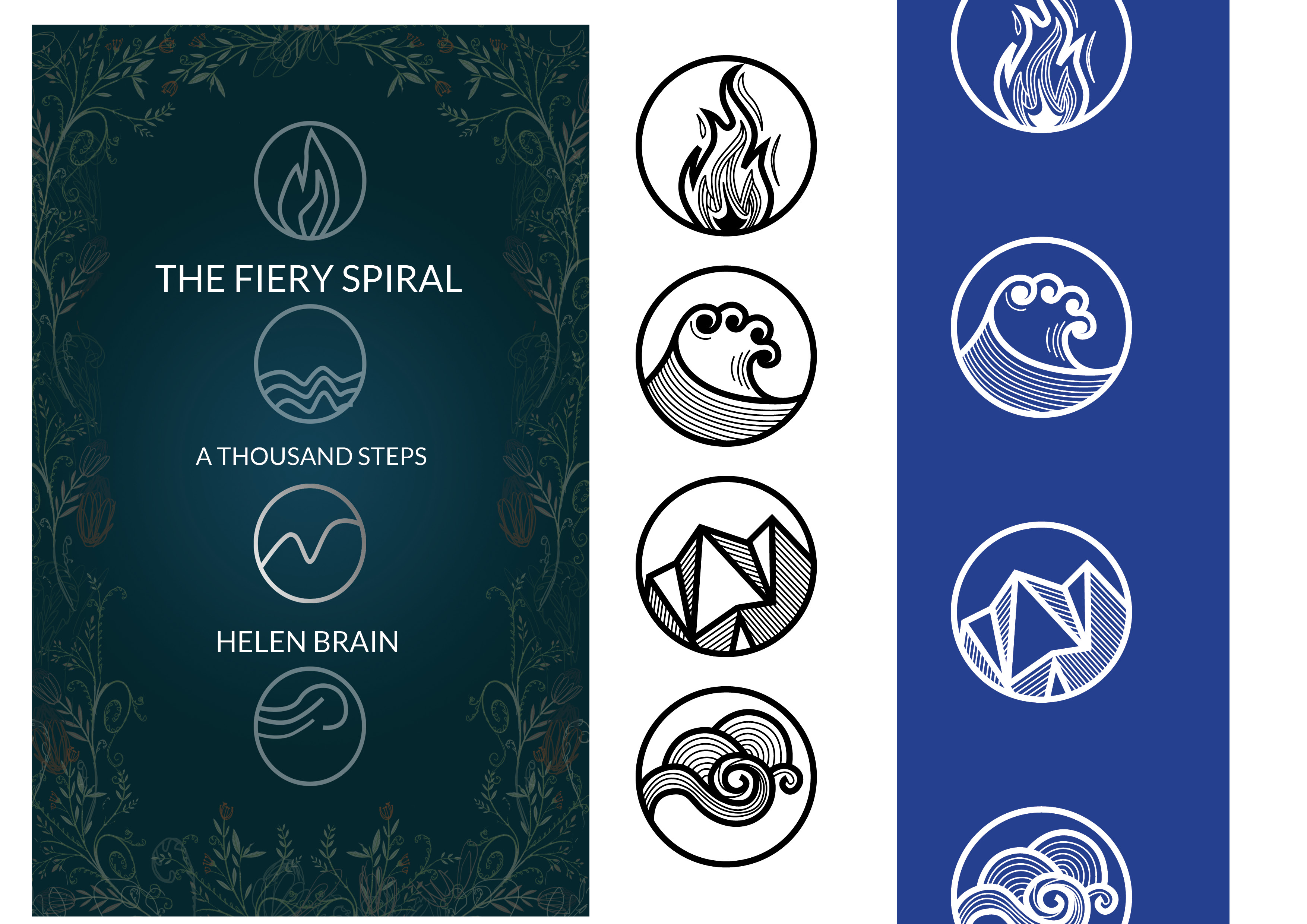 The protagonist has unusual red hair, and I liked the idea of this vast grey, post-apocalyptic landscape with this tiny figure only noticeable because of her flash of bright hair. Another idea was portraits of Ebba with the amulets around her neck, her red hair spilling out over the cover. The third and chosen design has the amulets representing the four elements in the middle, surrounded by fynbos, plants that are particular to the setting of the story. The cover is very dark with a slightly lighter area in the middle to reflect the darkness inside the bunker and the single shaft of light from above.
By the time I have done the concept boards, it’s often tough for me to distance myself from my work and have an objective opinion. Sometimes I have a favorite, but it is best at this point to hand it over to Jessica to gather feedback and choose a cover. In this instance, I would’ve had a hard time choosing. Luckily I didn’t have to.
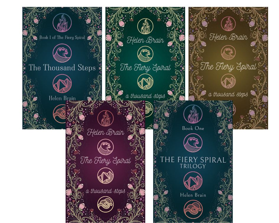
I crafted the design of the cover and sent it back to Jessica and Helen for feedback. It took a bit of playing around to land on the best fonts, colors and weightings. While I might sit alone in my flat drawing and designing, it is a team effort. There was a bit of back and forth and options before I got it right. It’s all part of the process. In the end, you want a cover that everyone is happy with, that is visually engaging and gives a potential reader a clear idea of what type of book to expect without giving too much away. It’s fun, and I get a kick out of seeing the final cover. To be honest, sometimes it’s as much a surprise to me how it will turn out as it is for everyone else!
Why do you feel the final one works best?
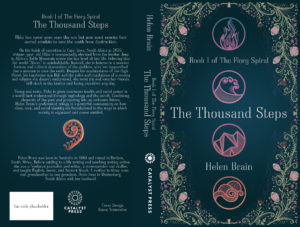
I’m very happy with the end result. If I saw it on a shelf, I would pick it up to see what it’s about. It’s pretty, and it has a mysterious vibe which I think works with the books. I’ve already designed the cover of book two, and I know what book three’s cover is going to look like, so I feel confident that we made the right choice! The design works on its own and as part of the series. I’m excited to design cover number three and eventually to have the whole set.